For a very long time, I have wanted to create a business podcast. I have done one or two and then not had the time, people power or oomph to keep it going. This year will be the year, although already it has had a hiccup. I found a topic, I found two guest speakers with heaps of expertise.
Just a couple of small issues. There is no sound on my computer, and each of us lived more than 100 kms from each of the other of us. Found the technology, (twice). It didn’t work either time. So while I go back to the drawing board for the rest of the year, I will present my topic and two guest speakers as an interview.
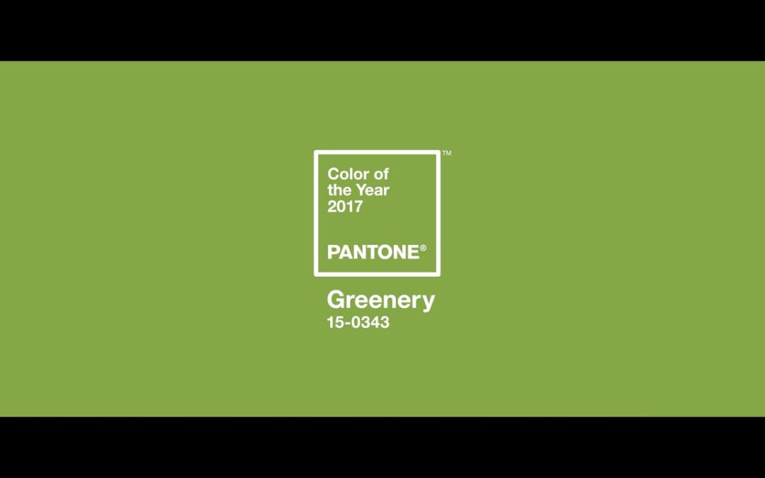
Our interview was all about the colour green. To be precise, Pantone’s 2017 colour of the year – Greenery.
Pantone describes Greenery “as a life-affirming shade, emblematic of the pursuit of personal passions and vitality”. Illustrative of flourishing foliage and the lushness of the great outdoors, the fortifying attributes of Greenery signals consumers to take a deep breath, oxygenate and reinvigorate.
Our first guest, graphic designer and interior designer, Alana Ryan starts off by telling us a bit about green from a design point of view.
Alana is currently working as an interior designer for a wholesale textile company. Alana’s passion for all things design, led her to further her skills by studying graphic design.
She works full time in the interior design industry, whilst completing small to large graphic projects under her own business name AR.C Design Studio.
Alana has done some graphic design projects for some of my clients and I can highly recommend her.
Welcome Alana
I am interested in your thoughts as a designer on using a colour of the year, whether it be in graphic design or in the new office – is there a risk that the colour defines itself as 2017 into the future?
The Colour of the year is selected as a trend forecast as the colour that is expected to been seen throughout fashion, design and culture coming forward.
Trends are trends, they do usually have an expiry date. However, working in design, I have seen the interest in the colour green increase in the past 1-2 years, although previously they were richer colours such as Emerald Green.
With the current trend and society pushing towards the importance of health and wellbeing, sustainability, and the current trends in Interior Design (in regards to indoor plants etc), this colour makes sense on a global scale.
It is great to see such a fresh and vibrant green like Greenery forecasted for this year.
Do you think being a colour of the year influences decisions about colour in graphic design?
Yes, to a certain extent. Design is always about being on trend or the next best thing. As Greenery becomes popular and known through use, the colour may influence the way of colour schemes, the overall feel and font colour choices.
However, in terms of web design and marketing design I think the colour of the year has less of an impact.
Generally the selection of colour for web design/marketing is selected to reflect the brand, and although it is important to keep up with current trends it is also important to create a difference whilst also reflecting the brand.
This colour will most likely be used throughout web and marketing purposes for business/websites/for marketing collateral day spas, wellbeing etc. due to green being related to peace, nature and relaxation.
Would businesses would use the colour because it is the colour of the year, or is it the colour of the year because people are using it?
In terms of interior design, I think we will start to see this colour throughout homes in coming months, through paint and decor accessories, but also in fabrics such as velvets and linens for upholstery and cushions.
I think the colour will be used in different ways – paired with warm colours such as reds and yellows for a tropical scheme or with blues for a cooler look and feel, or even with neutrals to make the colour of the year stand out.
Interior design is very much about what is on trend and how it can be used in relation to what the client already has or their needs. Whereas I find graphic design, particularly in relation to business, is more about the brand and what it reflects.
What does green mean to you as a designer?
To me, green is the colour of Relaxation, Calmness, Balance, Growth and Sustainability. It reflects our environment, our nature, our landscape. It’s part of our everyday life, Pantone describe it as ‘our nature’s neutral’ and I absolutely agree!
I would now like to introduce our second guest Dari Rees (of Dari Rees Colours).
Dari has been working with colour professionally for over 30 years. She originally qualified with Beauty for all Seasons USA which complemented her background in fashion and soft furnishings.
Dari’s focuses on how we can use colour to enhance our lives and see ourselves as unique with our own style expression, regardless of fads and fashion, regardless of income or status.
She has worked extensively with women in transition and is an Aura-Soma® Practitioner. Dari describes herself as a Colour Tarotist, an Intuitive Colour Catalyst, Soul Stylist and Wardrobe Warrior.
Welcome Dari, I wonder if you can talk to us about the colour greenery in an esoteric sense?
What does that mean for 2017?
Green in general will allow the space we need to do the things that need to be done. Thus, if we tune into green we will feel that we have more time and space.
Pantone’s colour of the year Greenery, has quite a lot of yellow in it and I feel that working with this colour may lead to more cooperation as opposed to competition. Bringing more feminine leadership. More like minded people joining together. This colour is a unifier, a lively colour which brings about the opportunity for regeneration and healing.
Everyone needs green in some form as it helps us with direction, making decisions, generosity, freedom and openness. An absolute breath of fresh air!
Some of the Pantone choices come and go but I feel that Greenery is of benefit to all.
Do you think that businesses are influenced by a colour of the year?
Businesses will always be curious about latest trends and will be influenced in some way. Even if it is coffee cups and cushions!
I feel that this is a great colour for business this year, as it lightens things up giving more hope and possibility. To be more consciously aware of this colour in business should bring results.
Very interesting perspectives on colour in general and Greenery in particular. I think it will make me more sensitive to my surroundings and colour in my work. Thanks for organising these interviews!
Thanks for your comment Mary-Faeth, we have been using Greenery more in our designs. We all need direction, decision making, generosity, freedom and openness in our work.