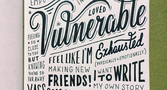
For some reason, blogs about fonts and typography often show up in January. They are nearly always a good read and an opportunity to learn something new and this one from Hubspot is no exception.
It is a nice way to start the new year, wanting to be sure that your followers can read your posts and that their experience is a positive one. That requires legibility, clarity and thoughtfulness.
Also of interest to me was reading about which emotions and personality traits are most commonly associated with various fonts. Did you know that Courier New is thought to be Sad Dull and Unattractive or that Cumbria and Arial are seen as stable.
A valuable article on matching your font with your information and message.
Unfortunate, however, that they missed the opportunity to discuss fonts for the billions of followers with low or decreasing vision. As discussed in a previous blog of mine, everyone’s vision starts to deteriorate in their 50s. Some fonts are better than others for those with decreasing vision. A challenge to a typographer to help educate designers on accessible design including fonts.
If you would like some further information about ensuring that your publications are accessible, or you want to hone your messages so that people find them, see them and act, talk to us about how we can help you.


